The end of the summer marks the return to school and a time to digest our favorite summer publication: the Gartner Hype Cycle for Emerging Technologies Chart. Every year I feel a bit confused about this graph. Folks in B2B sectors swear by it and have pointed out that in the last two years the internet of things reached the dangerous ‘peak of inflated expectations’.
Keen to dispel this largely constructed myth, I wanted to map out the last 10 years of this chart, analyse how the internet of things discourse is ongoing and show that this yearly report is nothing more than a snapshot of anxieties and aspirations in the technology sector as well as a reflection of what technologists really wish would pick up regardless of reality.
If you decide not to read on and just click on the pretty picture:
- In yellow: topics which I connect to the internet of things
- In orange: topics related to 3D printing
- In blue: random topics which Gartner don’t seem to want to kill off when many other come and go.
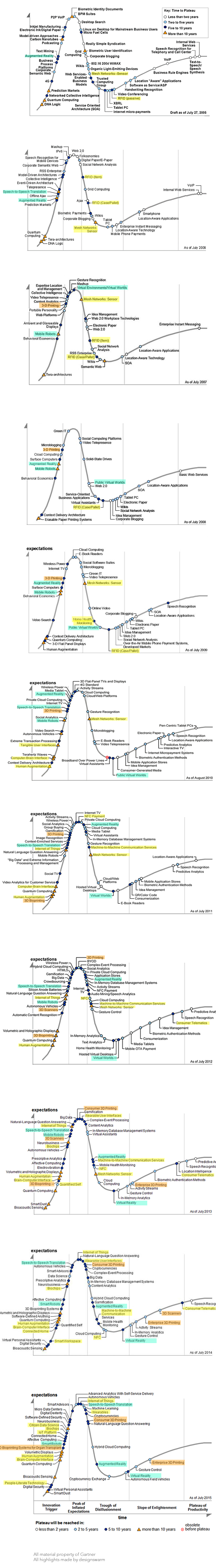
In the beginning there was nothing
So let’s go back to 2005. I was still in Ivrea and the Arduino had just made its first batch. What does anyone know about the internet of things? Well judging by that year’s chart nothing. Nevermind that Kevin Ashton had coined the term back in 2001 and that Nabaztag and Ambient Devices were going strong. There is nothing but RFID and mesh network love for the 2005-2009 charts. And because we’re in the throngs of Second Life love-in, augmented reality and virtual worlds start to make an appearance and basically never leave the chart. The only virtual reality headset I’ve seen in the wild is in the BBC R&D’s North Lab over a year ago. Just saying.
Smart health
The 2009 chart sees the first appearance of Home Health Monitoring. It reappears again in 2012 but doesn’t come back again. Why? Well noone likes to think about death, not designers, not technologists, even if there’s a huge amount of money there. It’s also an area massively regulated making it difficult for startups to get involved in but certainly not possible (just ask Glowcaps, Kemuri or Lively). You don’t need to look very deeply to see that the health sector and families dealing with chronic illness and palliative care could do with innovative services but somehow these existing companies don’t help this term make a reappearance in its own right. Robots (first described as mobile then smart) on the other hand have been moving up and down the beginning of the chart since 2007. Having worked on a social robots project in the past I think the chart also reflects the amount of press particular areas receive.
Late on the 3D printing game?
The path of 3D printing is the proof of this. I studied industrial design from 200-2004 and 3D printing was an integral part of our education with resources available and cost for prototyping rather low for one offs but it doesn’t make it onto the chart until 2007, the year a commercial printer is available below $10K. The Makerbot, which offered open-source 3D printing for a lot less, launched in 2009 but it isn’t till 2013 that the chart separates ‘Consumer’ from ‘Entreprise’ 3D printing. They were also mapped at very different levels, but considering Makerbot’s acquisition and recent layoffs in 2014, I’m not sure how long ‘Consumer’ 3D printing will stay on this list at all.
Aspirational thinking
Topics and technologies tend to either linger on or come and go on the chart. Lots of blogging then micro-blogging between 2005-2011 until they simply dissappear. Tele conferencing and Virtual assistants come and go to disappear in 2010. Virtual worlds and augmented reality never leave the chart and one has to wonder why the insistence. Knowing a little about how Gartner does their research, this could be down to simply lobbying. This isn’t a scientific view after all even if industry treats it as so.
Multiplying endlessly.
So back to the internet of things, well as a separate item, it only appears in 2011, almost as NFC takes over from RFID (basically the same technology) meaning that the term is important enough to be considered on its own even of it’s not a technology at all. It’s an aggregate of technologies. So weak is the definition of the internet of things in the context of this chart that the subsequent years see the random appearance of topics which I’d have included under it: wearables, smart workplaces, smart homes, connected homes, human augmentation, biochips. etc. It feels like this year, the map was really just playing internet of things vocabulary bingo. The disappearance of ‘M2M technologies’ and the oddly named ‘consumer telematics’ is odd as well as the consumer and industry sides of the internet of things are often wrongly confused.
The even weirder ‘People-Literate technology’ points to a general trend in recognising the role of user-centered design, but that’s not a technology and I’m sure all technology providers have realised this at some point in their development.
But you know, still robots and virtual reality.
So why should anyone care about this chart? Well I think when presented in aggregate it speaks volumes about what we aspire to develop over time regardless of industry reality and what we too easily dismiss.
For internet of things developers, we should take comfort in seeing that #iot has been growing and that even if the terminology is getting muddled, it’s been here to stay for some time wherever it sits on the chart, because its position doesn’t matter, it’s the fact that it’s there at all, in multiple guises, its success and growth hiding in plain sight.